The YouTube app just got a makeover. Google’s online video site officially updated the design of its mobile app on July 23, 2015 to better enable video and subscription discovery.
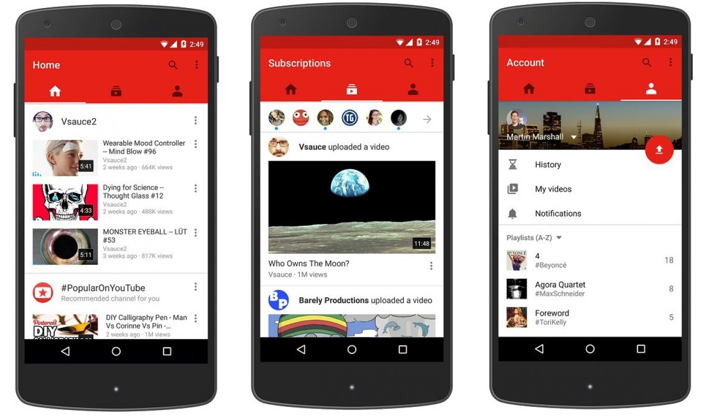
At her keynote speech during VidCon, YouTube CEO Susan Wojcicki outlined all the new features and elements of the re-designed app. For starters, the app’s re-worked editing and capture tools now help users trim video clips, add filters and music, and upload videos directly to YouTube, all from within the mobile experience. The YouTube app now also supports full screen playback of vertical videos, and boasts three simple tabs across the top: home, subscriptions, and account.
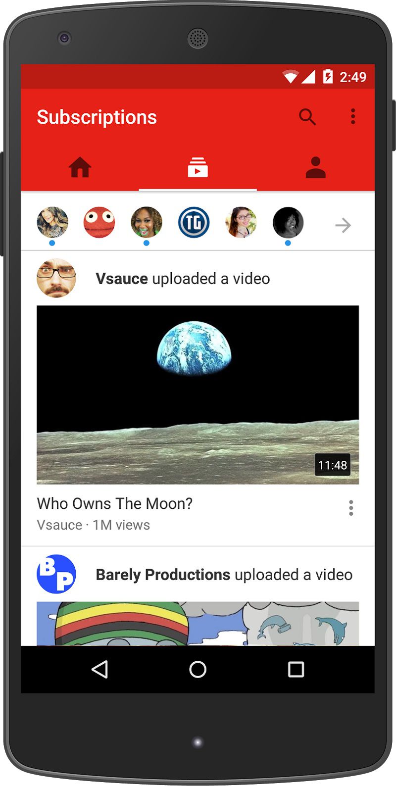
It’s that subscriptions tab which is the biggest update to YouTube’s mobile app, especially considering the online video community at large has had its fair share of complaints about the idiosyncrasies of YouTube’s current subscription system. Wojcicki noted how YouTube listened to users’ frequent demands for better subscription interactions and updates. In response, Google’s online video site made one of the main tabs dedicated solely to subscriptions. There, users can see the latest videos from the channels they’re following, as well as tap a bell icon to receive push notifications every time a creator uploads new content.
Subscribe to get the latest creator news
“We’ve got more new features coming later this year, all designed to give you the best mobile YouTube experience possible,” Wojcicki said.
You can read more about YouTube’s updated mobile app via the company’s official blog. And you can download the app via Google Play or the iTunes app store.