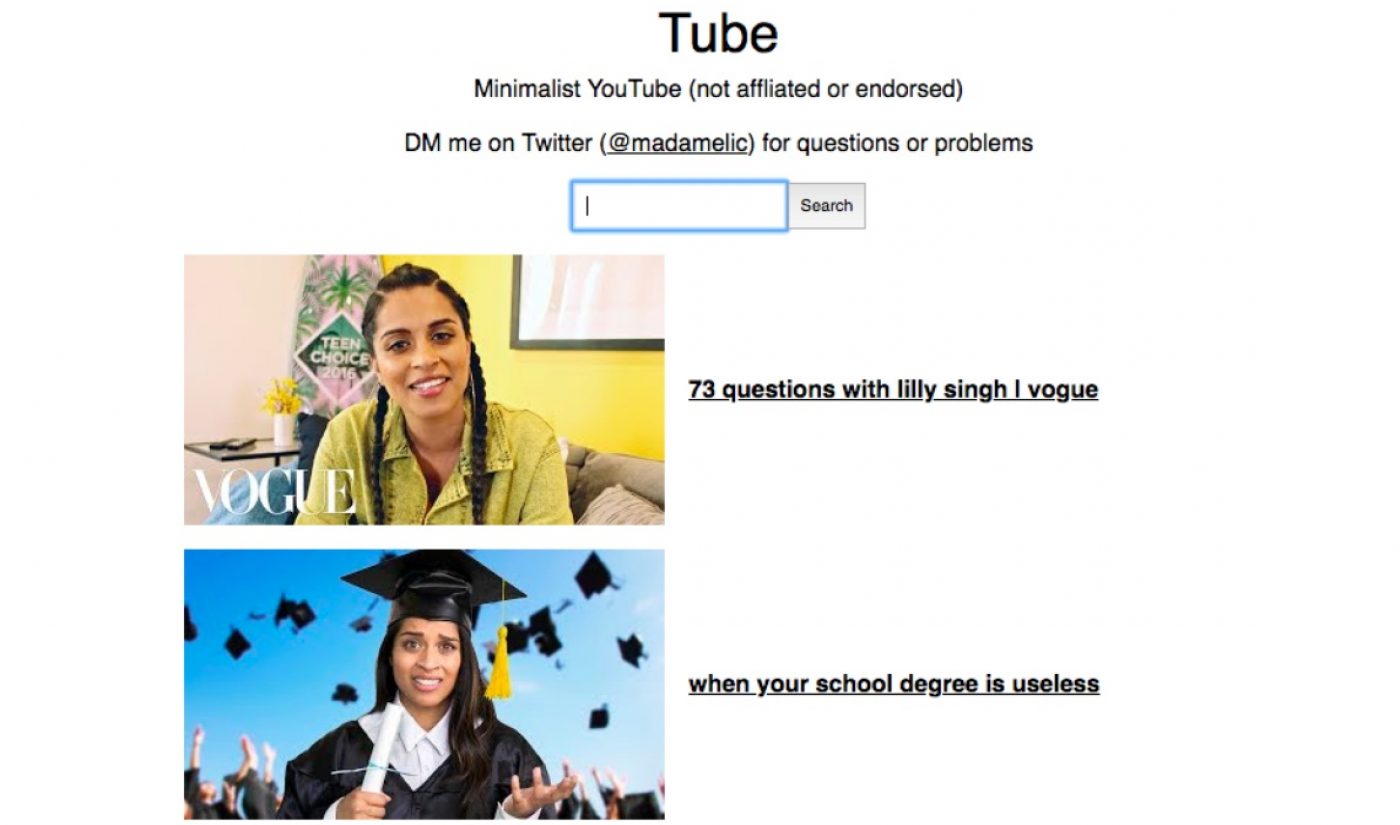
The YouTube viewing experience has become cluttered with recommended videos, trending tabs, subscription boxes, and many other bells and whistles, but when push comes to shove, a video site only needs to do one thing: Play videos. That’s the idea behind Tube, a new project launched on April 13 by software engineer Madeline Cameron. Tube, as its name implies, is a stripped-down, minimalist version of YouTube that offers little more than a video player and a search bar.
Tube, according to Cameron, provides a “non annoying and simple YouTube experience” to anyone who wants it. There are no recommended videos, no channels pages, and, best of all, no comments. The result is clean, distraction-free YouTube viewership.
Some outlets that have covered Tube so far, such as Lifehacker, have described Cameron’s project as a tool for avoiding the sort of binge-watching that YouTube’s UI promotes. Certainly, if you’re looking to watch a long lecture without being lured in by needless suggestions, Tube is a smart choice, though video recommendations still pop up once a clip ends. (Clicking on one will send you back to YouTube.)
Subscribe to get the latest creator news
There are, however, plenty other potential applications for Tube. Parents can use it to prevent (or at least dissuade) young children from clicking things they should click, and viewers with spotty connections will surely appreciate Tube’s light design. Who knew that reducing YouTube to a layout that resembles the mid-aughts internet could have so many uses? As we love to say here at Tubefilter, everything old is new again.