 It’s a frustrating experience anytime YouTube changes the design of its website.
The video sharing destination is kinda like a remote control for the internet. A remote control that 147-or-so million people in the US are very comfortable using. It can be confusing when the design or layout of that remote control changes. It’s like going over to a friend’s house, turning on the television, and having to watch Melissa and Joey because that’s what’s on and you don’t know how to change the channel to your new favorite show Franklin and Bash or use the channel guide because when you press “Channel Up” the input switches from the cable box – which is not the same cable box you own and not provided by the same cable company that provides your cable – to the PS3.
With all that in mind, my initial reaction to YouTube’s new TestTube experimental layout codenamed Cosmic Panda is I like it not. Everything’s changed! But after watching a few dozen videos, I must say the Panda makes for a much more pleasant viewing experience.

Subscribe for daily Tubefilter Top Stories
First, YouTube’s changed the background color on its videos from white to black. Second, you can watch the video on that new black background in one of four different sizing options by clicking on the four different rectangles located below the video and to the far right.
Third is the part that seems a little out of whack that I wish YouTube would standardize but can’t probably because the site’s database is structured in a particular format that it needs certain types of videos to behave certain ways in certain situations. YouTube treats the videos in playlists differently than videos you just happen upon. It displays them differently, too.
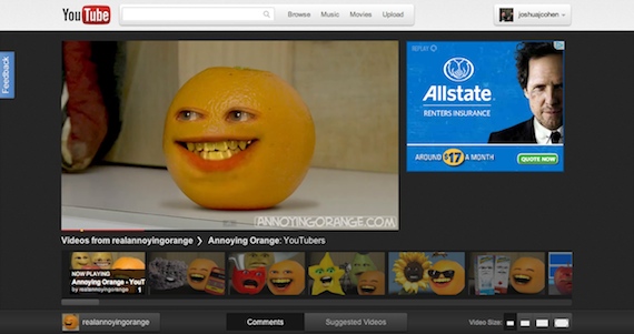
Here’s a recent episode of Annoying Orange from a Playlist. The video is front and center with a scrolling carousel featuring all the other videos in the playlist directly below. Below that you’ll find your comments and on the right sidebar are your video details and specs. The Suggested Videos have disappeared behind the Suggest Video button (which toggles between those videos and comments) and been replaced by a design that makes it way easier to watch multiple episodes of a series in sequential order. That’s a good thing!
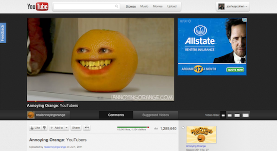
Here’s a recent episode of Annoying Orange from a rando YouTube search. There’s no fancy scrolling carousel of other videos in the same playlist and the comments are below the video details and specs, which are below the video. The Suggested Videos is still on the right side bar, though with seemingly better suggestions. The art for those suggestions is also prettier and more panoramic than its boxy predecessors. (And if you want more Suggested Videos, you can still toggle between them and comments by clicking those buttons below the video.)
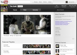
The channel pages are completely made over. There’s no space for customized branding available at the top of the pages like there was before (at least not yet). Total Video Uploads, Total Subscriber Numbers, and Total Video Views numbers are prominently displayed at the top right of each page. Huge panoramic pictures promote individual episodes. Smaller film strips show a sampling of what’s in all of the channel’s playlists. Details about the channel, its creators, and its featured channels have been moved to the right sidebar.
Gone (at least for now) is the ability to search uploads by Date Added, Most Viewed, or Top Rated. That’s the most significant change on the Channel Pages I can find. It’s both good and bad. Good because it may encourage viewers to check out more videos from creators and not just their most popular uploads. Bad because often times you just want to easily find and watch a creator’s most popular uploads.
Bottom line: The bigger, panoramic images, black background, and ease of series viewing makes for the Cosmic Panda one sexy YouTube layout. If the good people at Google can re-institute sorting video uploads by Date Added and Most Viewed, get away with the two kinds of page louts for playlists and non-playlists, and add back in customizable headings for channel pages, I’ll be a happy online video watcher.
Check out YouTube’s new layout for yourself here and let us know what you think.

