In recent years, Google has favored a unified design philosophy called Material Design, which it has favored on many of its owned-and-operated properties. Now, that layout is starting to become more prominent on YouTube. The video site has announced a redesigned look which viewers can test out by opting in here.
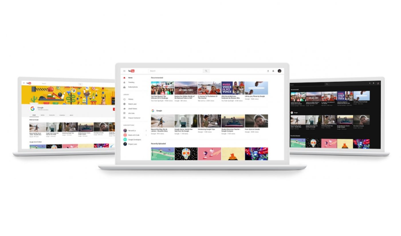
The new design isn’t drastically different than the old one, but there is a little more white space between individual elements, at least on the homepage. In a press release, YouTube noted that it has focused on removing “visuals that can distract from your browsing or watching experience,” and the new layout is certainly a little cleaner than previous iterations of YouTube.
YouTube also noted that the redesign is built on a framework called Polymer, which the video site said will “quicker feature development from here on out.” As part of its commitment to creating new offerings for its viewers, YouTube has made its first official announcement of the dark mode discovered by some observant users last month. Consider turning on that option if you tend to browse the web just before your bedtime.
Subscribe to get the latest creator news
In general, this update doesn’t seem like the sort of redesign that will get people up in arms, but on the internet, you never know. YouTube has favored Google’s Material Design philosophy for at least a year, so it should come as no surprise that the video site is taking further steps in that direction.