Earlier this summer, online video audiences noticed some changes to YouTube’s website, including a larger video player, that were rumored to be related to its upcoming music subscription service. Now, the site has made some even more tweaks, though some visitors might not see any difference.
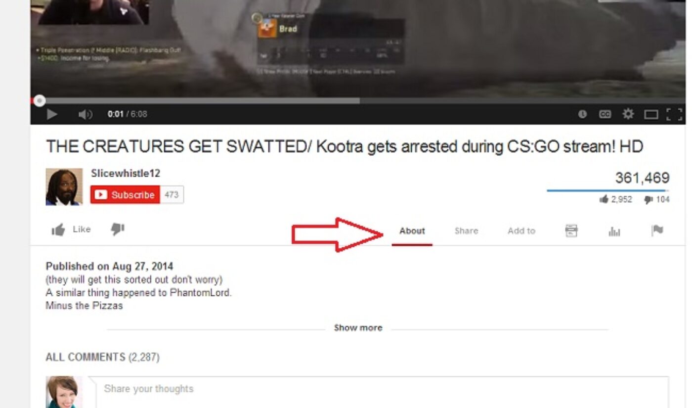
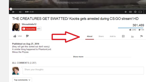
The Next Web reports that YouTube has moved its “Add to,” “Share,” and “More” buttons from the right-hand side to the left, giving the information bar a little more breathing room:
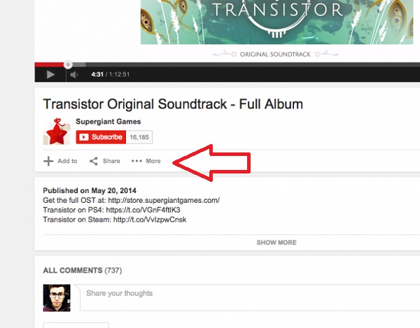
However, when I visited YouTube this morning to watch a video, I didn’t see the change that The Next Web was talking about:
Subscribe to get the latest creator news
The Next Web also claims the “What to Watch” page has been adjusted ever-so-slightly, but there’s no indication on my end that it has. Here’s a comparison image taken from July 21, 2014 (courtesy of archives.org) and today, August 29, 2014:
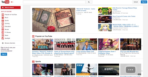
YouTube on July 21, 2014 from archives.org

YouTube on August 29, 2014
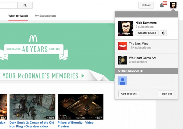
While I didn’t notice the above changes, I did see the more organized account menu, as did the TNW author. Now, when you click your picture in the upper right-hand corner, you can see your channels separated cleanly by grey headers, making it easier to understand which account you’re using and which ones you can switch to.
Additionally, users have noticed some other insignificant changes, like the site having an overall flatter, more streamlined (aka less cluttered) look.
I’m not the only one unable to see many of YouTube’s adjustments. A comment left on The Next Web article indicates at least one user didn’t see any of the supposed changes, and another user suggested the site could be doing A/B testing. This could be a possibility, so don’t fret if you can’t see anything yourself, as it doesn’t affect your viewing experience.