Thumbnails are the most important aspect of any video’s release, other than the content itself. Seriously. This is because thumbnails, in combination with titles, are often the biggest deciding factor in whether or not a person will click to watch a video.
Due to their overwhelming importance, we at Frederator have put together a guide for creating thumbnails that details the principles and tactics we use when crafting our own thumbnails. These are insights gained from conversations with creators, reading the YouTube Playbook, and countless experiments with various design types, all while measuring the click through rates and performance of our thumbnails through YouTube’s TrueView advertising.
The Main Goal
Subscribe for daily Tubefilter Top Stories
The main goal for our thumbnails is to get our audience, and new audiences, to view our content and then go on to watch more of our content. We have found that there are three main guiding principles that allow us to achieve this goal.
The Three Principles
The three guiding principles Frederator uses for making clickable thumbnails are:
- Our thumbnails accurately portray the content in the video.
- Our thumbnails get our audience excited about watching the video.
- Our thumbnails draw the attention of our audience.
We discovered these principles by the methods I described above and abide by them because they work. We want to engage our online video audience and see it grow. In order to do that, viewers need to actually watch our content. And in order for viewers to actually watch our content, our thumbnails must be exciting and draw in their eyes. And in order for our viewers to to want to watch more of our content, our thumbnails must accurately represent what’s in the video and stand out among all the others on the YouTube platform.
The following tactics, listed in order of importance and value, all incorporate our three principles to varying degrees.
The Tactics
1. Use close ups on faces, preferably making eye contact.
Humans have evolved to detect eye contact, making thumbnails with eye contact more eye-catching, especially if the whites of the eyes are visible. In addition to this, humans communicate in large part by reading emotional cues on the face.
Examples of closeups & eye contact (PewDiePie, Smosh, Michele Phan, CartoonHangover):

2. Show strong emotions.
To take this one step further, showing strong emotions is also beneficial. Strong emotions are easily identifiable and makes the viewer feel that same heightened emotion through empathy. When a viewer becomes emotionally connected with something or they want to feel that emotion themselves, they are more likely to click on your video.
Examples of strong emotions (PewDiePie, Smosh, AllThatGlitters21, Cartoon Hangover):

3. Use bright backgrounds.
Bright backgrounds stand out against the white background of YouTube, and also stand out in relation to other thumbnails without a bright background. In addition, we’ve had a lot of success using the sunburst or pinwheel effect which draws the viewers eyes back to the vanishing point, which we place directly behind the face. This in turn draws the viewers eye to the subject again, and makes the subject of the thumbnail pop out even more.
Examples of bright backgrounds (Ray William Johnson, Fine Brothers, Shane Dawson, Tobuscus):

4. Use contrast and outlines.
Contrast and outlines allow for the subject of the video to stand out against the background. They also give the subject of the thumbnail a depth of field, making the subject stand out even more.
Examples of contrast and outlines (Epic Rap Battles, FreddieW, Shane Dawson, Tobuscus):

5. Usage of text.
Generally, we try to avoid text on thumbnails. The titles of our videos should be enough copy but in some instances, such as in gaming videos, using text is vital. When using text we have found that using three to four words maximum is best, making sure the text stands out from the background with a heavy outline or contrasting colors.
Examples of text on thumbnails (Smosh, Epic Meal Time):

6. Bugs and branding.
Bugs (a small logo or watermark) and branding are essential for great thumbnails. A good bug or brand helps your thumbnails stand out against other thumbnails on YouTube because it’s a clear signal to the audience that this is one of your videos. Since your audience is easily able to identify the video as one of yours, they are more likely to click that video.
Examples of Bugs & Branding (Vice, MondoMedia, Cartoon Hangover):

7. Consistency.
Consistency, much like using a brand or bug, allows viewers to easily identify your videos. Consistency in thumbnail design includes color pallet, layout, number of subjects, arrangement, font, and other elements.
Examples of Consistency (Shane Dawson, Epic Meal Time, Cartoon Hangover):

8. Design for the small screen.
The majority of impressions your thumbnail will receive – whether those impressions are on a mobile device, the related videos column, or the homepage feed – will have very small dimensions. At Frederator, we estimate that 55% to 70% of our thumbnail impressions are small-scale. Therefore, you should design for these small sizes.
For example, this image, from Cartoon Hangover’s Rocket Dog is pretty good as a thumbnail according to the above criteria. Its a closeup on the face, features a strong emotion of shock, and is all on a bright blue background:

However, when we shrink it down to the size of most thumbnail impressions, the use of this image as a thumbnail is not very good:

However, if we zoom in on the face, it’s much better:

9. Choosing colors.
When choosing colors for our thumbnails, we often try to use complementary colors. Complementary colors are colors that are opposite of each other on the color wheel.

We choose complementary colors because these are colors that stand out against one another.
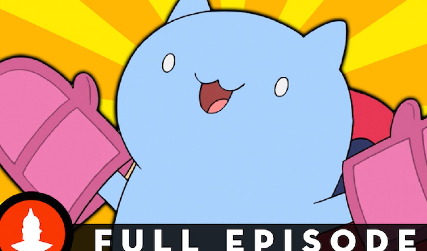
For example, if the subject of our our thumbnail is blue, such as in this Catbug thumbnail, we choose a yellow and orange background. Since these are complementary colors (blue and orange) they stand out against each other, which draws in the audience’s eyes.

In addition, we also sometimes use analogous color patterns (colors that are next to or near each other on the color wheel), as these are pleasing to the. Here’s an example of that in the background of this thumbnail:

We also try to use yellow whenever possible. The performance of thumbnails that include yellow is statistically better than thumbnails without yellow. This is primarily due to the fact that humans only perceive the color yellow when both the M-Cone (Green) and L-Cone (Red) are stimulated (or essentially when green and red light is mixed). This causes more receptors in our eyes to trigger, making yellow stand out more.
In addition, we have greater sensitivity to yellow light because it occurs at high points in the red and green wavelengths:

Fun fact: This is also one of the reasons school busses, taxis, and caution signs are all yellow.
10. Easy to see and understand.
Your thumbnails should be easy to see and understand to the casual viewer. This means that your thumbnails should visually tell the story of what your video is about.
For example, both of these thumbnails are for videos about making a rainbow cake:

The second thumbnail clearly tells the story of the video, where the first thumbnail does not. The first thumbnail is dark and does not show the finished product. The second thumbnail is bright and shows the finished product. The second thumbnail visually shows the audience what the video is about (a woman making a rainbow cake), where the first thumbnail just shows the audience what happens in the video (a hand pouring green stuff onto blue stuff in a pan).
Furthermore, the second thumbnail is visually appealing to an audience (a picture of a smiling woman and a delicious looking cake), where the first is not visually appealing (someone pouring not-so-delicious-looking liquid into a pan).
11. Represents the first 15 to 30 seconds of a video.
Not only is it important that a thumbnail represents the video in principle, but in terms of tactics a thumbnail should also represent the first 15 to 30 seconds. This is because of the nature of viewership on YouTube. If an audience feels duped by a misleading thumbnail, title, or combination of both, they will almost immediately click away.
If a video is structured so that the best thumbnail and title combination occurs later in the video, then we suggest either reorganizing the video before uploading, or mentioning at the beginning of the video that the topic of the thumbnail and title will be covered later in the video.
12. Avoid placing anything important in the lower right hand corner.
YouTube often covers the lower right hand corner with either a timestamp or a watch later button. The lower right hand corner is also the last place a western viewer will look due to the way that audience reads (left to right, top to bottom). Therefore, avoid placing copy or images in the lower right hand corner.
Example of right hand corner being blocked:

13. Analyze your competition.
At Frederator, we are constantly looking at the thumbnails of other channels that are making similar content and have similar audiences. We do this so we can see the kinds of thumbnails our competitors have conditioned their audiences to click.
For example, a channel The Channel Frederator Network is currently distributing – called “Toy Pizza” – makes videos about toys. Their thumbnails, by most measures were really great:

However, once we looked at the thumbnails for channels that had similar audiences, we noticed that the audiences that we wanted to watch Toy Pizza were conditioned to click on a much different type of thumbnail:

The thumbnails these audiences were clicking on showed the toy in full, with muted backgrounds, often with text. They also mostly only showed one toy in each thumbnail. After realizing this, Toy Pizza made some adjustments and began making thumbnails that were appealing and familiar to their target audience, which increased the performance of their videos.
Before and After:

Test, Experiment, Analyze, and Repeat
At Frederator we spend a lot of time on our thumbnails. As a result we really want to know how our thumbnails are performing. Unfortunately, there is no thumbnail analytics data available through YouTube analytics. However, there’s a secret method that we use to find out how your thumbnails perform.
Through Google’s TrueView advertising platform, a person is able to see the relative click through rate for all of the videos they advertise. This is a handy tool to compare thumbnails at an extremely low cost (a few bucks a day).
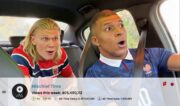
For example, over the last 20 months we’ve had 8 different templates for the thumbnails on Cartoon Hangover (another channel we distribute on YouTube). Some we kept for extended periods of time (four months or longer) and some we’ve kept for no more than two weeks. This is because we’re able to quickly see, through TrueView, how our thumbnails perform.
These are the thumbnails with the varying templates we’ve used for just one of our episodes over the last 20 months, along with their relative click through rates:

If you do not want to use AdWords, you can also look at your Views Per Unique and Views From Subscribers as indicators of how clickable your templates and thumbnails are. This metric is muddied by a lot of factors, such as your title, programming, and YouTube’s algorithm, but it can give you a general picture of how your thumbnails are doing.
The Exceptions To The Rules
There are many content types that do not conform to all of these tactics (however, they do all conform to the principles). Some of our favorite exceptions are listed below with examples of great thumbnails from those categories.
Hair, Make Up, Beauty & Fashion:

Products, Unboxings & Product Reviews:

Food & Cooking:
Horror, Paranormal & Scary:
Autos:
Educational:

The Final Ingredient
Every great thumbnail needs an equally great title. We look forward to bringing you Frederator’s Definitive Guide To Making Great Titles right here on Tubefilter. Be sure to stay tuned.
 Matt Gielen is the Director of Programming and Audience Development at Frederator. Matt leads the programming team building Cartoon Hangover (currently at more than 1.3 million subscribers, 100 million views) and The Channel Frederator Network (with more than 300+ partner channels, 7.5 million subscribers, 1 billion+ views). You can follow Matt on twitter @mattgielen.