Recently, Vimeo has rolled out a number of original programs as it expands to set up new revenue streams for its creative community. For its most recent update, though, the video platform has gone back to basics. It has simplified its mobile site with a “smarter, speedier” design that matches the platform’s artsy flavor.
The new mobile design replaces a look Vimeo implemented last year. At the time, that design served as a modern update for the site’s mobile users, but over the past 19 months, Vimeo has come to regard that interface as too busy and unnecessarily complex. “The old mobile version of our site…tried to do a bit too much — it bit off more cookies than it could cache,” reads a post on Vimeo’s official blog. “That’s why we’re busting out an all-new mobile version of vimeo.com. It knows it can’t do it all, but what it does do, it does well.”
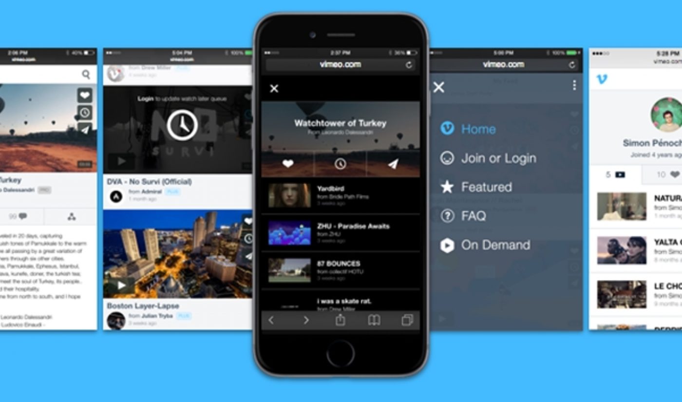
The new mobile site retains a search bar at the top of the page, while other navigational functions have been moved to a clean menu that can be accessed at the bottom of the page. The new design also emphasizes the “Watch Later” feature, which allows users to save videos and view them across multiple devices.
Subscribe for daily Tubefilter Top Stories
All in all, the new update will better serve the increasing number of viewers who watch videos on mobile devices. Vimeo ended its blog post by noting that “more features are on the way, including integration with our native apps.” We’ll keep our eyes peeled to see how Vimeo links up its iOS and Android offerings with its sleek new site.