
YouTube has debuted a new experimental homepage—click here to try it out—and I, being a lover of design and its critique, feel like sharing my thoughts on it.
First, let me give you some details. This button will appear on your homepage if you’ve been selected to join the experiment:
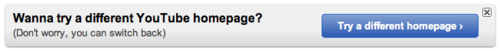
Subscribe to get the latest creator news
Clicking that brings you to this page which details changes about to take effect on your homepage—what you see when logged in and viewing YouTube.com:
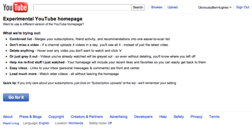
Here’s what the page says in text form:
Experimental YouTube homepage Want to use a different version of the YouTube homepage?
What we’re trying out: Combined list – Merges your subscriptions, friend activity, and recommendations into > one easier-to-scan list Don’t miss a video – If a channel uploads 4 videos in a day, you’ll see all 4 – instead of just the latest video Delete anything – Hover over any video you don’t want to watch and click ‘x’ Or just grey it out – Videos you’ve already watched will be greyed out – so even > without deleting, you’ll know where you left off Help me re-find stuff I just watched – Your homepage will include your recent likes and favorites so you can easily get back to them Easy inbox – Links to your inbox (personal messages & comments) are front and center Load much more – Watch older videos – all without leaving the homepage
Quick tip: If you only care about your subscriptions, just click on “Subscription uploads” at the top – we’ll remember your setting
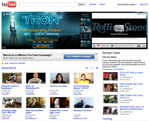
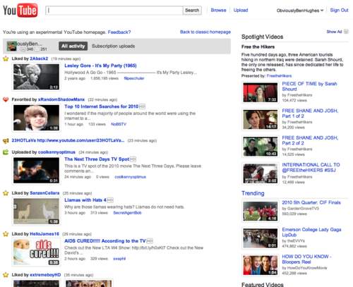
And lastly, a before-and-after comparison between the old and new homepages. As a sidenote, I closed the huge TRON advertisement at the top of the new version in order to show as much of it as possible.
BEFORE:
AFTER:
OK. There are a few things right off the bat that I notice.
First, I like that the layout is focused on bringing things that fellow YouTubers like, comment on, or favorite to your attention. This information comes directly from your Friends and Subscriptions in to one “merged” list. If someone who you’re friends with likes, comments or favorites a video, it shows up here along with any new video uploads from users you’ve subscribed to.
That being said, I highly dislike that “Friend” activity is now merged with the “Subscriptions.” It’s helpful that if you click the Subscriptions tab that YouTube will remember your settings (hopefully) but even when you set that to the default there are more problems.
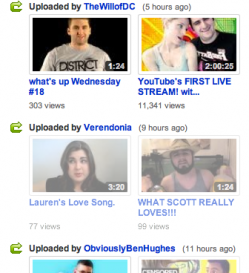 There needs to be a few changes with the Subscriptions tab. I like that you can see all recent uploads (up to four) from a content creator, but what if that person has only uploaded one video within the recent time period? They still take up just as much vertical space as someone with four new uploads. An option to consolidate people with only one recent upload in to fewer lines (perhaps by putting two, three or four different content creators on one single row) would be most helpful. That would allow users to scroll less, as well as lessening the chance of missing a new video because it’s below the page-break.
A feature that flat-out needs to be gone: greyed out video thumbnails after that certain video is viewed. When you watch a video from someone you’re subscribed to, that video’s thumbnail doesn’t simply disappear from your homepage subscription box. Instead, it gets “greyed out” (so it looks faded) and you then have to click a small “x” in the corner of the thumbnail to remove it from the list. This is simply redundant work for users, and adding more steps to the subscription-viewing process is really, for lack of a better phrase, quite dumb.
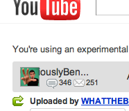 And lastly, little thing that really annoys me is this truncated bug.
First, my username is truncated due to length, which makes no sense. There should be enough room for twenty characters (the character limit for a YouTube username) to be visible. Partial username visibility is just plain lame in this advanced web world. Second, what’s with the odd alignment of the username? I want to see the beginning of my name just as much as I want to see the end of it. Of all the new changes, this should be the easiest fix to implement.
So there you have it. Those are my thoughts on the new experimental YouTube homepage design. After more time getting used to it I assume I’ll have more thoughts, but this is a good stopping point for now.
I would be really interested in hearing your thoughts on the design. Let me know in the comments: Love it or hate it?
 Ben Hughes is a vlogger and freelance graphic designer with a strong passion for using social media for good. He’s had the honor of speaking at Microsoft and is currently working with YouTube to enhance the relationship between company and community. Subscribe to Ben on YouTube.